Data Visualization
Overview
Teaching: 0 min
Exercises: 0 minQuestions
How can I create publication-ready figures with Python?
Objectives
plot data in a Matplotlib figure.
create multi-panelled figures.
export figures in a variety of image formats.
use interactive features of Jupyter to make it easier to fine-tune a plot.
What will be covered
- A Primer on Data visualization
- Plotting in Python
- Plotting from pandas
- Where to go from here
- Additional challenges
A Primer on Data visualization
In the modern day of technology, data visualization is all around us in many forms. This discipline combines design, communication and creativity to convey a message through pictures.
A picture is worth a thousand words - Fred R. Barnard
This quote transpires how powerful and impactful a picture can be. In data science, these pictures or images are often referred to as charts or, more broadly, plots. A well crafted image, such a graphical abstract, can summarize an entire work of several pages in a few square centimeters.
Where there is great power there is great responsibility - Winston Churchill
As much as an image can be used for information, it can be used for misinformation. Automatic behavior, formatting mistakes or deliberate manipulation, can lead to misleading messages by displaying data in erroneous or unclear ways.
There are many pitfalls to data visualization, far too many to cover in this small primer. If you would like to have a better overview and avoid them on your own images, the book Fundamentals of Data Visualization by Claus O. Wilke is an excellent resource and is freely available online.
Plotting in Python
The words plotting and plot have their origin in plotters, devices that use pens to replicate the human act of drawing. Plotters became popular thanks to their ability to produce high quality results.
The Python community has developed several frameworks to generate plots,
also known as charts or graphs.
In this tutorial we will focus on the older and mature matplotlib package,
which has a large user community, and many examples in its gallery
to pick from. Although matplotlib was originally developed for 2D plotting,
newer versions are capable of 3D plotting, which had a big facelift in version 1.0.0.
Other plotting frameworks include:
seaborn- production ready figures usingmatplotlibbokeh- a plotting library with emphasis on interactivity and browser experiencealtair- a Python interface to the popular vega-lite JavaScript frameworkplotly- a versatile, interactive library by the company with the same nameplotnine-ggplot2for Pythonfolium- a toolkit for handling topographical data
Getting Started with matplotlib
matplotlib provides more than one interface to generate plots.
In this chapter we will combine pyplot with object-oriented syntax,
further detailed below.
pyplot users generally alias this import to plt.
To get started use:
import matplotlib.pyplot as plt
You may also find matplotlib examples referring to matplotlib.pylab.
This is an alternative interface that combines numpy and pyplot functions
under one shared namespace. However, its use is nowadays discouraged in favor of:
import matplotlib.pyplot as plt
import numpy as np
The Origin of the Name
matplotlibwas conceptually inspired in MATLAB, a popular commercial platform known for its numerical and plotting capabilities.If you have experience with MATLAB you will find some of the concepts in the following section quite familiar.
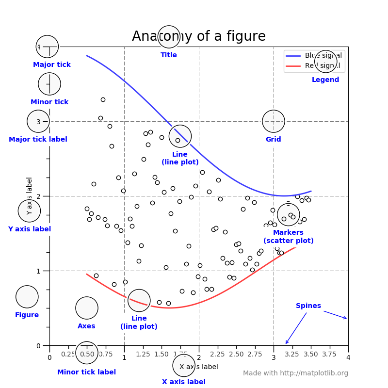
The Structure of a Plot
matplotlib follows the object-oriented philosophy of separation of roles.
A plot is composed by a hierarchy of objects.
At the top-level we have a Figure, representing our canvas.
fig = plt.Figure()
print(fig)
Figure(640x480)
A Figure can then contain one or more plots, also called subplots.
A plot is represented by an Axes object which, among other elements,
contains the plot title, legend and Axis.
# (1, 1, 1) = nrows=1, ncols=1, index=1
# which creates a 1 x 1 area and returns the first (and only) index
axes = fig.add_subplot(1, 1, 1)
print(axes)
xaxis = axes.get_xaxis()
print(xaxis)
yaxis = axes.get_yaxis()
print(yaxis)
AxesSubplot(0.125,0.11;0.775x0.77)
XAxis(80.000000,52.800000)
YAxis(80.000000,52.800000)
In turn, Axis contain a label and ticks, the spaced markings for major and minor units.
xlabel = xaxis.get_label()
print(xlabel)
xticks = xaxis.get_ticklabels()
print(xticks)
Text(0, 0.5, '')
<a list of 6 Text major ticklabel objects>
You will also notice the Text object in the above output.
Text is part of the Artist category of objects, containing objects that
represent graphical, as opposed to structural, elements in plot.
Overall, a Figure is composed of the following elements:
Axes vs Axis
The names
AxesandAxiscan be confusing as the first is the plural form of the second. You could think ofAxesas a collection ofAxis, however, it’s easier to think ofAxesas a subplot which in turn contains two or moreAxis.The following figure from older matplotlib documentation clarifies this distinction
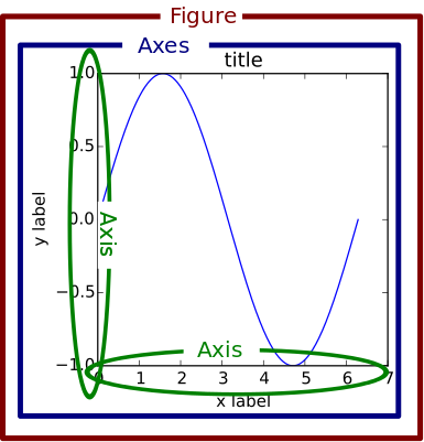
You can also read more about figure elements in the usage section of matplotlib’s tutorial
A Bird’s-eye View
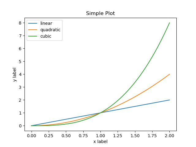
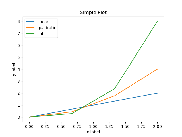
So now that we learned about the different components, we can see how to put it all together:
import matplotlib.pyplot as plt
import numpy as np
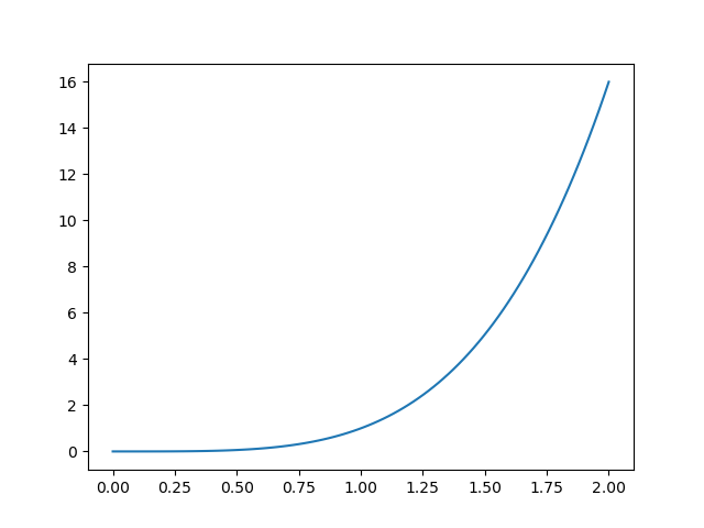
x = np.linspace(0, 2, 100) # Generate an array of 100 values between 0 and 2
fig, ax = plt.subplots() # Create a figure and an axes.
ax.plot(x, x, label="linear") # Plot some data on the axes.
ax.plot(x, x**2, label="quadratic") # Plot more data on the axes...
ax.plot(x, x**3, label="cubic") # ... and some more.
ax.set_xlabel("x label") # Add an x-label to the x axis.
ax.set_ylabel("y label") # Add a y-label to the y axis.
ax.set_title("Simple Plot") # Add a title to the Axes.
ax.legend() # Add a legend.
fig.savefig("my-simple-plot.png") # Save the plot to a file in PNG format
which when executed produces the following plot:
As a Figure object can be initialized in more than one way,
you may also see other code variants such as:
import matplotlib

fig = matplotlib.figure.Figure()
ax = fig.add_subplot()
...
In both cases we primarily create an Axes object by calling to a subplot function.
This style of matplotlib code is often referred to as object-oriented.
An alternative approach is to rely solely on pyplot.
In this case the code looks quite similar but we always refer to functions in plt,
instead of Axes or other objects.
import matplotlib.pyplot as plt
import numpy as np

x = np.linspace(0, 2, 100)            # Generate an array of 100 values between 0 and 2

plt.plot(x, x, label='linear')        # A Figure and Axes are implicitly created here
plt.plot(x, x**2, label='quadratic')  # subsequent calls are added to the same Axes
plt.plot(x, x**3, label='cubic')
plt.xlabel('x label')                 # as are labels.
plt.ylabel('y label')                 # Note also that we call ylabel() not set_ylabel()
plt.title("Simple Plot")              # similarly title() instead of set_title()
plt.legend()
plt.savefig("my-simple-plot.png")     # This is the same as before
which produces the exact same output as before.
The pyplot (plt) interface simplifies usage and saves us from typing a few extra characters.
However, you will find that since the Figure and Axes handling happens behind the scenes,
there are cases where this style is limiting.
Consider for instance the following code:
plt.plot(x, x**4, label='quartic')
plt.savefig("my-second-simple-plot.png")
If you run this code after running the above example you will see the following output:
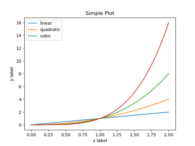
which may not be what you expected. In fact, several strange things happened here. We have most of the information from the previous plot and the legend misleadingly only shows 3 lines although 4 are plotted.
This happens because matplotlib.pyplot keeps track of the instructions up to that point
and unless you tell it that you are done with the previous figure,
the next plot will be plotted over the existing one.
On the other hand, if we were using the object-oriented style, since we called:
fig, ax = plt.subplots()
a new Figure and Axes are explicitly created and so we would be less likely to
run into this situation.
If you actually wanted a clean slate after the first plot, you could tell pyplot
that you are done with the previous Figure by using plt.close():
plt.close()                               # Closes any existing Figure & Axes
plt.plot(x, x**4, label='quartic')        # so that next time we call .plot()
plt.savefig("my-second-simple-plot.png")  # we get an empty canvas
Which would produce:
Selecting a Backend
When you tell matplotlib to plot, there’s a number of things happening behind the scenes.
Before you even get started it needs to have a canvas to draw on.
This canvas can have different properties, support saving to different formats,
interactivity and even customizing the plot to some extent.
In the above examples we used plt.savefig() to save our plots to a PNG file.
Alternatively we could have used plt.show() which, depending on your operating system
and how you installed matplotlib, may cause a window with your plot to appear
or instead you may see a warning:
UserWarning: Matplotlib is currently using ___, which is a non-GUI backend, so cannot show the figure.
Similarly, when running your plotting code on a server or an environment where a window cannot be opened, you may instead see one of the following error messages:
cannot connect to X server
Could not connect to display
no display name and no $DISPLAY environment variable
This behavior can be controlled by selecting a different backend. You can find the full list of supported backends, and their capabilities, in the official documentation.
By default, matplotlib tries to be smart and choose the most appropriate backend
to use in your system, which can be inconvenient.
For simplicity, we will use the Anti-Grain Geometry (Agg) backend and avoid the plt.show() function.
This will ensure our code will always produce a result,
regardless of if a display is available or not.
The backend should be specified as early as possible using the matplotlib.use() function like so:
import matplotlib
matplotlib.use("Agg")
import matplotlib.pyplot as plt
From this point onwards, plt.show() will display a UserWarning
but plt.savefig() will work fine on any computer as long as
you have matplotlib.
Other Formats
In the above examples, we always specified that we wanted to save the result as a PNG file.
This is a bitmap or raster format which is compact and practical for visualization.
However, if you are planning to use your plots in your next publication,
or to add some extra annotations to the final figure,
you may be happy to know that matplotlib can save your plot in a vector format such as SVG or PDF.
Simply change the extension of the file in plt.savefig() to produce a different format.
x = np.linspace(0, 2, 100)

plt.plot(x, x, label='linear')
plt.plot(x, x**2, label='quadratic')
plt.xlabel('x label')
plt.ylabel('y label')
plt.title("Simple SVG Plot")
plt.legend()
plt.savefig("my-second-simple-plot.svg")  # we now get an SVG output

Plotting with Jupyter
In previous chapters you have seen how Jupyter prettified pandas dataframes
and made it convenient to interactively explore data.
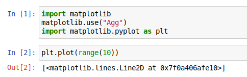
Jupyter and matplotlib also get along pretty well and we can have plots displayed
as the output of a cell. However, if you jump right in you may not get what you expect:
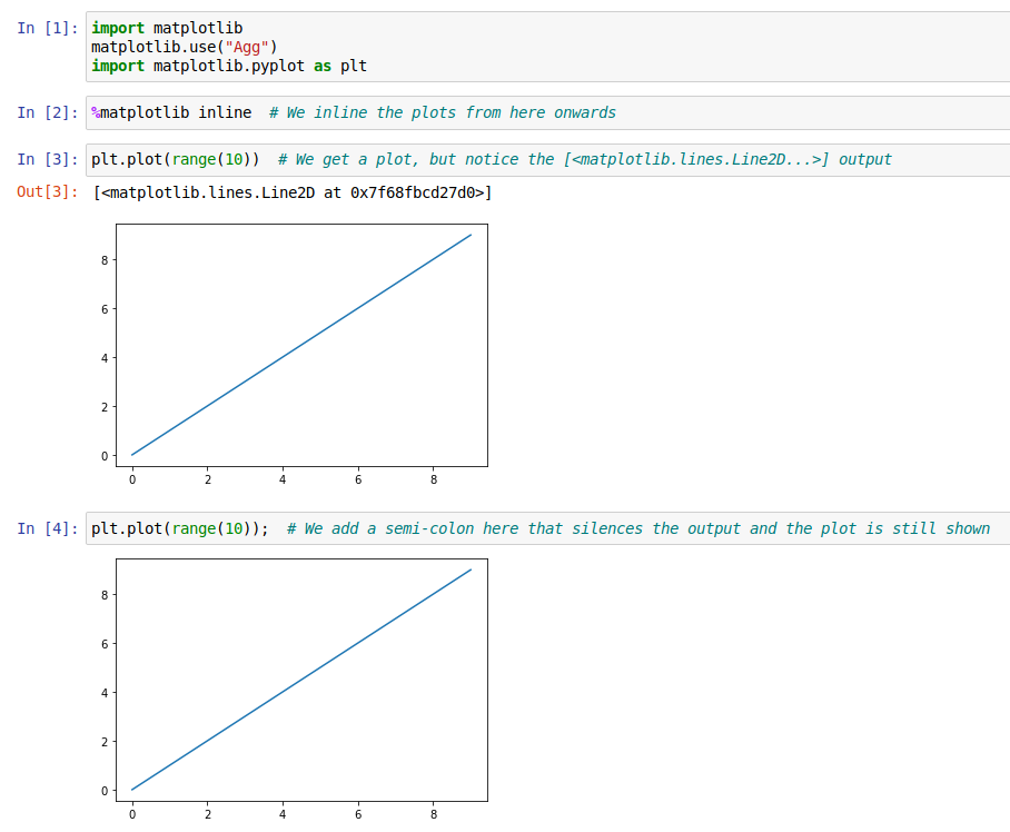
To have plots displayed, you need to use a “magic command”,
characterized by the % prefix.
These special instructions are not valid Python but are understood by Jupyter.
So, to have matplotlib plots displayed after the cell, also known as inline,
you need to add %matplotlib inline to one of your notebook cells,
typically after your imports.
If you want to silence the output of the last command while still displaying the plot,
you can also add a semi-colon (;) to the last line of your cell.
Plotting Options
Subplots
In the a bird’s eye view section
we used both fig, ax = plt.subplots() and ax = fig.add_subplot()
to create an Axes object.
We also mentioned that a Figure can contain one or more Axes.
If we don’t provide additional arguments to these functions,
they return only one Axes object.
A more practical use would be to construct a figure with multiple panels.
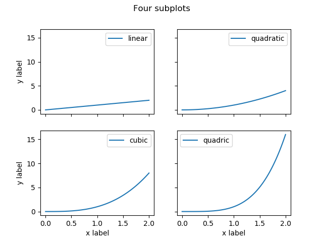
If we wanted to generate a figure with 4 panels we could use:
plt.subplots(nrows=2, ncols=2)
# or simply
plt.subplots(2, 2)
Taking our example from above we would then get 4 Axes objects to plot on.
x = np.linspace(0, 2, 100)

# We create a Figure with 4 panels, 2 by 2
fig, axes = plt.subplots(2, 2)

# axes is a 2D numpy array of the form
# ([top-left, top-right], [bottom-left, bottom-right])
# so we use the extra set of parenthesis to unpack both levels
(topleft, topright), (bottomleft, bottomright) = axes

topleft.plot(x, x, label="linear")
topright.plot(x, x**2, label="quadratic")
bottomleft.plot(x, x**3, label="cubic")
bottomright.plot(x, x**4, label="quadric")

# We use flatten() to traverse the 2D axes array as a 1D array
for ax in axes.flatten():
    # and we set legends in all Axes
    ax.legend()

# But we only need to set X labels on the bottom-most panels
# We don't need to use .flatten() here because axes[1, :] returns a 1D array
for ax in axes[1, :]:
    ax.set_xlabel("x label")

# And Y labels on the left-most panels
# We don't need to use .flatten() here either because axes[:, 0] returns a 1D array
for ax in axes[:, 0]:
    ax.set_ylabel("y label")

# Finally, each Axes can have a title but the Figure can also have a "super title"
fig.suptitle("Four subplots")

fig.savefig("fig/subplot.png")
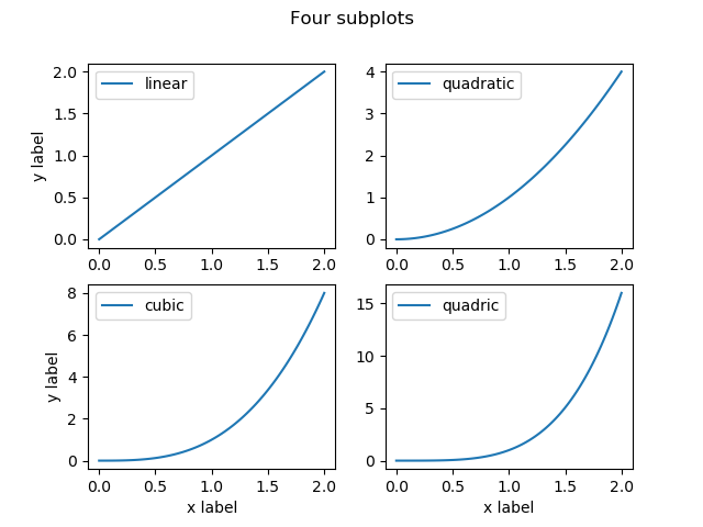
And we got a great looking result.
If instead of independent panels, you are plotting facets or dependent variables, you should additionally specify that the subplots should have the same minimum and maximum limits for both X and Y axis.
This can either be done manually by iterating over each Axes
or more simply by providing the arguments
sharex=True and sharey=True to plt.subplots().
# A 2 by 2 subplot sharing both axis
fig, axes = plt.subplots(2, 2, sharex=True, sharey=True)
Notice that sharing both axis automatically hid the axis on the inner subplots.
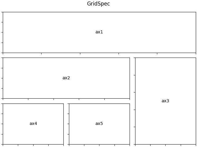
GridSpec
If you need a finer control over the placement and arrangement of subplots,
matplotlibalso provides theGridSpecinterface which can be used together withfig.add_subplot(). You can find a gridspec example in thematplotlibgallery.
Line plots
Line plots are one of the most common kinds of plot you can create
with matplotlib.
As we saw above, you can create a line plot by providing a set of X and Y coordinates. The order of the points will dictate how lines will be drawn. Consecutive points will be connected with a line.
Picking on our example from before:
import matplotlib.pyplot as plt
import numpy as np

start = 0
stop = 2
samples = 100

x = np.linspace(start, stop, samples) # Generate an array of 100 values between 0 and 2

plt.plot(x, x, label='linear')        # A Figure and Axes are implicitly created here
plt.plot(x, x**2, label='quadratic')  # subsequent calls are added to the same Axes
plt.plot(x, x**3, label='cubic')
plt.xlabel('x label')                 # as are labels.
plt.ylabel('y label')                 # Note also that we call ylabel() not set_ylabel()
plt.title("Simple Plot")              # similarly title() instead of set_title()
plt.legend()
plt.savefig("my-simple-plot.png")     # This is the same as before
The numpy function linspace() creates an array with values [0, 0.02, 0.04, ...]. Due to the small increment the plot looks like a smooth curve.
The plot() function takes X values as its first attribute and Y values for the second.
Given plot(X, Y) it then takes a pair of coordinates from both variables as with: (X[0], Y[0]), (X[1], Y[1]), ....
Beware of too many or too few data points
Keep in mind that
matplotlibwill try to plot all the data you pass as arguments. If your provide thousands of data points, you may not see a significant visual change but your plotting code will take considerably longer to produce a result. Similarly, if you don’t provide enough points, the linear interpolation produced bymatplotlibmay introduce misleading visual effects.
Nice and smooth
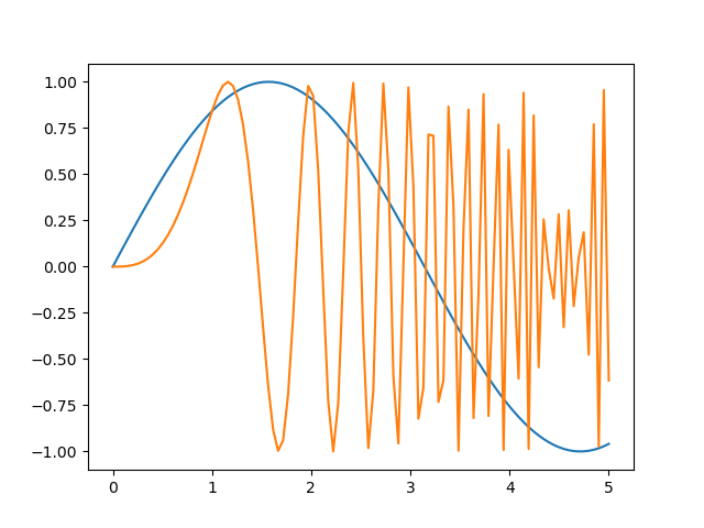
Modify the values in
start,stopandsamples, to produce alternative versions of the above plot with different degrees of smoothness. Play also with different mathematical expressions other thanx ** 2orx ** 3.
numpy’s documentation has a nice list of mathematical functions. For example, thesin()function is available asnp.sin().Solution
Using
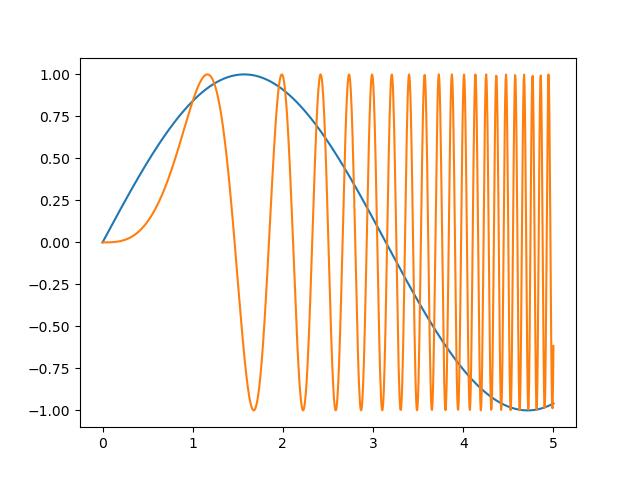
samples = 4the curve doesn’t look as smooth as before:And a sine plot would look like:
start = 0
stop = 5
samples = 100

x = np.linspace(start, stop, samples)

plt.plot(x, np.sin(x), label='sin')
plt.plot(x, np.sin(x**3), label='sin-cubic')

# And the other elements of the plot that we need to repeat
plt.xlabel('x label')
plt.ylabel('y label')
plt.title("Simple Plot")
plt.legend()
Notice also that as the values of
Xbecome larger, the number of samples is not enough and visual artifacts start to be noticeable in thesine-cubicplot.Using
samples = 1000makes most of the artifacts disappear:
Point plots and other variants
The plot() function is highly versatile by allowing us to modify the type of line drawn,
include point markers, use different colors, line thickness, and many other options covered in
the plot() documentation.
Modifying markers, lines and color is such a common task that this function
provides a convenient shorthand notation to specify all three options in one go.
You can supply a string with the "[marker][line][color]" notation as the last argument.
For example, "o-b" encodes a circle (o) marker, a continuous line (-) and both in blue color (b).
Each component is optional so providing only a line style ("-") or a marker and a color ("ob")
is perfectly valid.
As markers and lines are aspects of a plot that are common to other plotting functions,
they also have dedicated pages in matplotlib’s documentation.
You can visit the gallery of markers, the equivalent page for line styles
and the gallery of colors, to which you can refer by name, RGB or hexadecimal code.
Lets now try to customize our polynomial plot from before:
x = np.linspace(0, 2, 10)                     # We reduce the number of samples for visual clarity

plt.plot(x, x, "o-b", label='linear')         # full circles and continuous line in blue
plt.plot(x, x**2, "v--r", label='quadratic')  # down pointing triangles a dashed line in red
plt.plot(x, x**3, "*-.g", label='cubic')      # starts with dot dashed line in green
plt.plot(x, x**4, ".m", label='quadric')      # points without a connecting line in magenta
Although the aesthetic aspect could still benefit from additional changes,
we can see how we can conveniently modify the style of the plot.
Notice also that in the quadric case, omitting the line part of the formatting
style, disables drawing a connecting line.
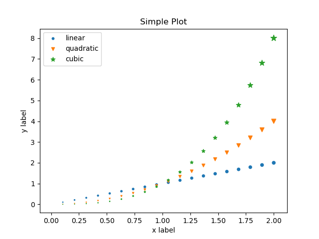
Point and scatter
matplotlibincludes also ascatter()function that provides additional features over simple point plots. Using thescatter()documentation and the scatter plot examples in thescatter()gallery section, create a variant of the point plot above with points of increasing size.Hint: you will need to use the
s=attribute of thescatter()function. See thescatter()documentation for additional options. You may also need to multiply all values by a constant if the difference in sizes is too small.Solution
Since
scatter()doesn’t draw lines, we cannot use the[marker][line][color]notation, but we can still specify themarker=style.A possible solution is:
x = np.linspace(0, 2, 20)
scale_factor = 10

plt.scatter(x, x, s=scale_factor * x, marker="o", label='linear')
plt.scatter(x, x**2, s=scale_factor * x**2, marker="v", label='quadratic')
plt.scatter(x, x**3, s=scale_factor * x**3, marker="*", label='cubic')

# And the other elements of the plot that we need to repeat
plt.xlabel('x label')
plt.ylabel('y label')
plt.title("Simple Plot")
plt.legend()
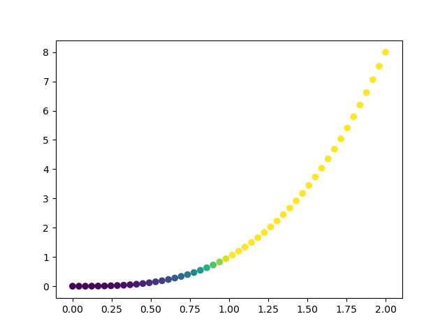
Colormaps
When plotting data, it is often convenient to use a color scales, be them continuous or discrete. Also known as gradient scales, or in matplotlib, colormaps, this feature simplifies the process of mapping values to color.
There are several considerations when choosing a colormap depending on the type of data and the purpose of the visualization. Some of the theory is visually illustrated in the colormap documentation.
To map values to a colormap, you need simply to pass the values to the colormap object and it will return colors for each point.
# also available as matplotlib.pyplot.cm or plt.cm
from matplotlib import cm

x = np.linspace(0, 2, 50)

plt.scatter(x, x**3, color=cm.viridis(x**3))
Histograms
Another very common type of plot is the histogram which can be produced using
the plt.hist() function.
A histogram is a bar-plot where one axis represents the range of values in the data being plotted,
and the other axis, a count of the values in the interval defined by the bar.
The width of the bars is determined by the bins attribute which specifies
how many bars should be displayed.
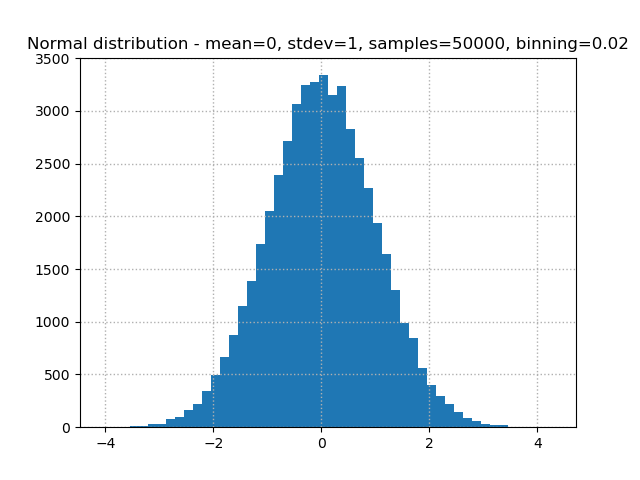
import numpy as np
import matplotlib.pyplot as plt

mean = 0
stdev = 1
samples = 50000
bins = 50

# Using numpy, take 50000 samples from a normal distribution
normal_dist = np.random.normal(mean, stdev, samples)

# Create a histogram with the sampled values
plt.hist(normal_dist, bins)

# Add a dotted thin line grid on both axis
plt.grid(linestyle="dotted", linewidth=1)

# Provide a descriptive title
plt.title(f"Normal distribution - mean={mean}, stdev={stdev}, samples={samples}, binning={1/bins}")
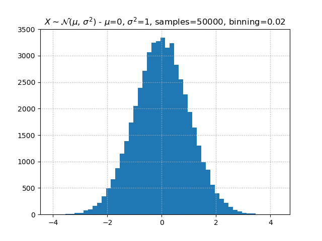
Matplotlib knows LaTeX
If you are familiar with LaTeX and like to have mathematical equations or symbols in your plot titles, axis labels or legends,
matplotlibhas your back. By surrounding text with$,matplotlibknow that it should interpret that content as LaTeX.So in the plot above, we could have used
$\\mu$=instead ofmean=to have a nicely typesetμcharacter in the title. Doing full stylization with LaTeX we could use:plt.title(f"$X \\sim \\mathcal{{N}}(\\mu,\\,\\sigma^{{2}})$ - $\\mu$={mean}, $\\sigma^{{2}}$={stdev}, samples={samples}, binning={1/bins}")and our plot would look like:
Since LaTeX instructions start with
\(as in\alpha), and the backslash is Python’s escape character, you will need to either, escape it with a second backslash\\(for\\alpha) or specify the text as a raw string literal by prefixing it withr, becomingr"\alpha".
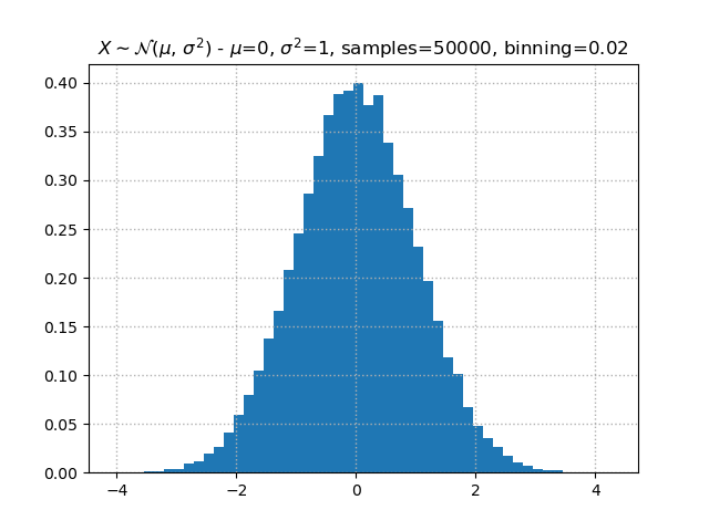
A Dense Histogram
Exploring the documentation of
plt.hist(), find how to add a probability density projection of the plot above.When plotting as density, the values in the
Yaxis change. Is this representation easier to understand than the default histogram with counts? What if in addition the histogram is made cumulative?Solution
The
plt.hist()function accepts adensity=Trueand acumulative=Trueoption. Although theYaxis values change, the bars should have the same visual representation (unless a new random sample was generated).A density plot transforms the
Yscale such that the area under the histogram adds to1. A value of0.40implies that the area occupied by the central bar represents 40% of the points.plt.hist(normal_dist, bins, density=True)
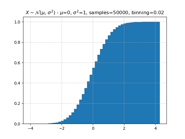
A perhaps more intuitive plot, is represented by the cumulative density, which as previously described should add to
1.plt.hist(normal_dist, bins, density=True, cumulative=True)
Bar
Before we saw histograms, a type of bar plot.
We can also produce bar plots in either vertical plt.bar(), or horizontal plt.barh() orientation.
In both cases, bars can be positioned next to each other or stacked. In order for matplotlib to grant us flexibility when drawing the bars, we have to handle the positioning ourselves. This is typically achieved by dividing the maximum bar width by a fixed factor, usually the number of groups being plotted.
In the following example we will produce 3 plots as subplots, a vertical grouped bar plot, a horizontal grouped bar plot and a vertical stacked plot
import numpy as np
import matplotlib.pyplot as plt
from collections import Counter

sequences = (
    "GAAGTACAAAATGTCATTAATGCTATGCAGAAAATCTTAGAGTGTCCCATCTGTCTGGAGTTGATCAAGG",
    "TGTAACTGAAAATCTAATTATAGGAGCATTTGTTACTGAGCCACAGATAATACAAGAGCGTCCCCTCACA",
    "CAGGAAAGTATCTCGTTACTGGAAGTTAGCACTCTAGGGAAGGCAAAAACAGAACCAAATAAATGTGTGA",
)

xlabels = ('A', 'T', 'C', 'G')
width = 0.3
# np.arange() is like Python's range() but allows floats and returns a numpy array
position = np.arange(len(xlabels))
counts = []

# Here we count the number of occurrences of each nucleotide
for seq in sequences:
    counter = Counter(seq)
    # for convenience we convert the dictionary-like Counter() object into a list
    # which is the format matplotlib expects (could have also been a numpy array)
    counts.append([counter[x] for x in xlabels])

fig, axes = plt.subplots(1, 3, figsize=(10, 5))
ax1, ax2, ax3 = axes

# For the stacked bar plot we need to keep track the height of the previous bar
# starting at zero
previous_height = np.zeros(len(xlabels))

for i, count in enumerate(counts):
    # Vertical bar plot
    ax1.bar(position + i * width, count, width)

    # Horizontal bar plot
    ax2.barh(position + i * width, count, width)

    # Stacked vertical bar plot - notice the bottom= attribute
    ax3.bar(position + i * width, count, width, bottom=previous_height)
    previous_height += count

# we can customize the X/Y labels to describe our groups of bars
# we also add the width to the position so labels are aligned with the central bar
ax1.set_title("Vertical barplot")
ax1.set_xticks(position + width)
ax1.set_xticklabels(xlabels)
# And in the horizontal plot we set the labels on the Y axis instead
ax2.set_title("Horizontal barplot")
ax2.set_yticks(position + width)
ax2.set_yticklabels(xlabels)

ax3.set_title("Vertical stacked barplot")
ax3.set_xticks(position + width)
ax3.set_xticklabels(xlabels)
Take a moment to read the code and the comments. There’s a lot happening here.
Notice how we use position + i * width to position the bar manually.
You may have also noticed that we used Axes functions instead of plt.*.
When working with subplots, it’s more convenient to use Axes directly.
There is a function plt.gca(), which stands for get current axes,
that can be used to access or modify attributes of a specific Axes
but this tends to complicate or make code harder to read.
Finally, if we execute the above code we get:
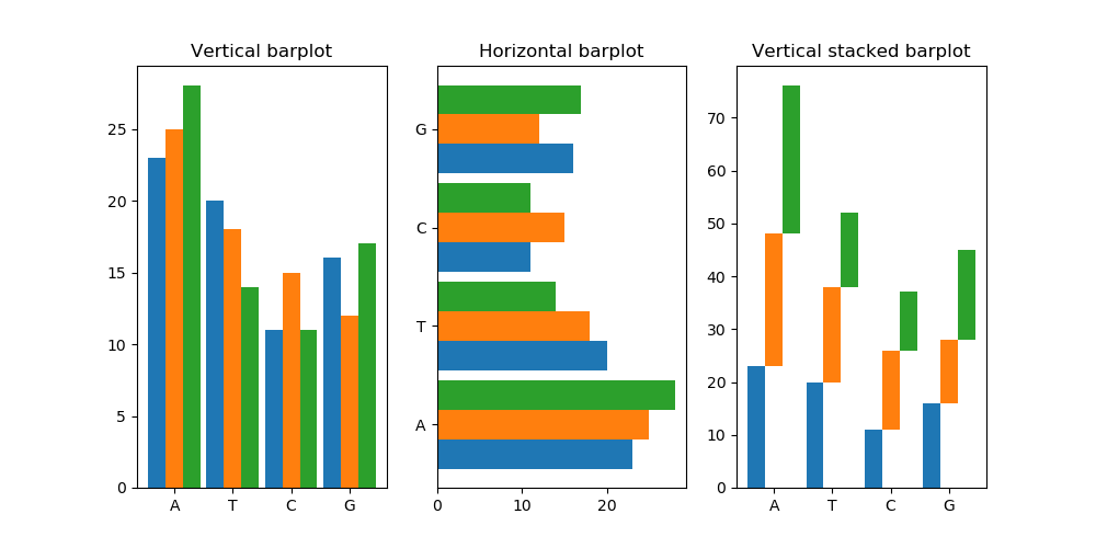
Which looks great, but something unexpected happened in the stacked subplot.
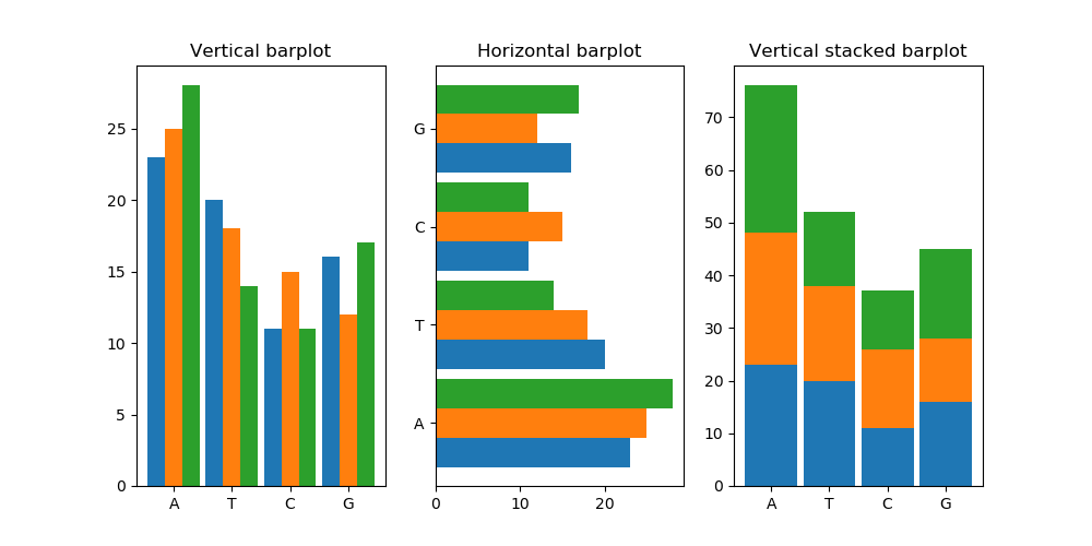
Fix the stairs
Can you fix the issue with the Vertical stacked barplot subplot in the previous code? It should be a stacked barplot but looks more like a staircase.
Hint: The bars are being stacked but something is pushing them off of their position.
Once done with the exercise, explore the effect of modifying
width. What happens whenwidth = 0.5or bigger than1?Solution
The problem with the stacked barplot is that we are still adding the
widthshift like with other barplot variants. If we modify the code to read:(...) # We remove the "i *" part of the code in this line ax3.bar(position + width, count, width, bottom=previous_height) (...)Alternatively we could instead remove the width attribute entirely, but doing that would also require us to modify the
ax3.set_xticks()line.If we don’t want the plot to look skinny we can also increase the width value.
stack_width = 0.9
(...)
    # We remove the "i *" part of the code in this line and replace width by stack_width
    ax3.bar(position + stack_width, count, stack_width, bottom=previous_height)
(...)
ax3.set_xticks(position + stack_width)
The result of this last version of the code is:
As for when
width = 0.5or larger, the plot gets distorted because bars from different groups start overlapping.
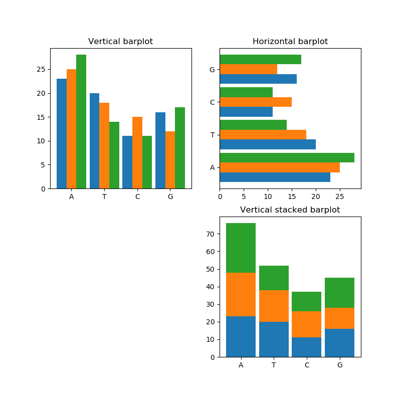
Rearranging Subplots
Change the previous solution so that the subplots are organised in two rows, leaving the bottom-left corner empty.
Solution
The key here is to ask for a square of subplots and disregard one of them
(...)
# We need only to modify the following lines
# We use a 2 by 2 figure, make the figure size symmetric
fig, axes = plt.subplots(2, 2, figsize=(8, 8))
# and since we now get a two dimensional array
# we need to expand each dimension
# since we want the bottom left to be empty, we can ignore that axis
(ax1, ax2), (unused, ax3) = axes
# and finally, if we also want to hide the axis and ticks we can call
unused.set_axis_off()
(...)
More plotting and drawing tools
Besides the plot variants mentioned above, Matplotlib can also produce
pie charts,box plots,contour maps,stream plotheatmaps/hexbin,geomaps, and many others, some composed manually and others via third-party extensions.If you want to add highlights to your plot in the form of arrows, countours, text or other graphical elements, matplotlib can perform all that and more, using annotations.
You can also affect how data is displayed by setting each axis to have an implicit data transformation. Matplotlib offers different types of logarithms as illustrated in the log demo, or using different projections such as polar coordinate system or geographical projections.
Plotting from pandas
As we saw at the end of the Working with Data section,
it is possible to plot data in a pandas DataFrame or Series
directly from the object itself.
By default, pandas uses Matplotlib to create these plots.
To demonstrate this, we will borrow a dataset prepared by Software Carpentry containing data on GDP, life expectancy, and population size from Gapminder.
import pandas as pd
gapminder = pd.read_csv('data/gapminder_all.csv', index_col='country')
print(gapminder.head())
             continent  gdpPercap_1952  gdpPercap_1957  gdpPercap_1962  \
country
Algeria         Africa     2449.008185     3013.976023     2550.816880
Angola          Africa     3520.610273     3827.940465     4269.276742
Benin           Africa     1062.752200      959.601080      949.499064
Botswana        Africa      851.241141      918.232535      983.653976
Burkina Faso    Africa      543.255241      617.183465      722.512021

              gdpPercap_1967  gdpPercap_1972  gdpPercap_1977  gdpPercap_1982  \
country
Algeria          3246.991771     4182.663766     4910.416756     5745.160213
Angola           5522.776375     5473.288005     3008.647355     2756.953672
Benin            1035.831411     1085.796879     1029.161251     1277.897616
Botswana         1214.709294     2263.611114     3214.857818     4551.142150
Burkina Faso      794.826560      854.735976      743.387037      807.198586

              gdpPercap_1987  gdpPercap_1992  ...    pop_1962    pop_1967  \
country                                       ...
Algeria          5681.358539     5023.216647  ...  11000948.0  12760499.0
Angola           2430.208311     2627.845685  ...   4826015.0   5247469.0
Benin            1225.856010     1191.207681  ...   2151895.0   2427334.0
Botswana         6205.883850     7954.111645  ...    512764.0    553541.0
Burkina Faso      912.063142      931.752773  ...   4919632.0   5127935.0

                pop_1972    pop_1977    pop_1982    pop_1987    pop_1992  \
country
Algeria       14760787.0  17152804.0  20033753.0  23254956.0  26298373.0
Angola         5894858.0   6162675.0   7016384.0   7874230.0   8735988.0
Benin          2761407.0   3168267.0   3641603.0   4243788.0   4981671.0
Botswana        619351.0    781472.0    970347.0   1151184.0   1342614.0
Burkina Faso   5433886.0   5889574.0   6634596.0   7586551.0   8878303.0

                pop_1997  pop_2002  pop_2007
country
Algeria       29072015.0  31287142  33333216
Angola         9875024.0  10866106  12420476
Benin          6066080.0   7026113   8078314
Botswana       1536536.0   1630347   1639131
Burkina Faso  10352843.0  12251209  14326203
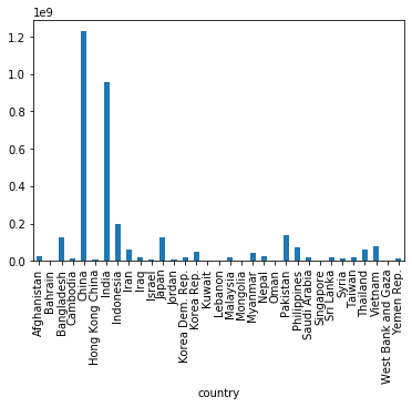
We can plot one of these columns,
e.g. the populations in 1997,
by selecting the column and then calling .plot:
gapminder['pop_1997'].plot()
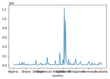
A good visualisation should give the viewer a better understanding of the underlying data. Clearly this isn’t a good visualisation! Perhaps more meaningful than showing the population of all countries in 1997, would be to show how the population of a single country has changed over time.
gapminder.loc['China','pop_1952':'pop_2007'].plot() # we provide a range of column names to .loc

As the examples above show,
the default is for the plot method to produce a line plot,
just like pyplot.plot.
(This is no coincidence,
as the pandas plot method is in fact
a wrapper for function calls to matplotlib.pyplot.)
We may specify our preference for another type of plot with
the kind parameter:
gapminder[gapminder['continent']=='Asia']['pop_1997'].plot(kind='bar')
Note: you can also use .plot.bar and .plot.<kind> more generally,
which is useful for getting help:
help(gapminder.plot.hexbin)
Help on method hexbin in module pandas.plotting._core:

hexbin(x, y, C=None, reduce_C_function=None, gridsize=None, **kwargs) method of pandas.plotting._core.PlotAccessor instance
    Generate a hexagonal binning plot.

    Generate a hexagonal binning plot of `x` versus `y`. If `C` is `None`
    (the default), this is a histogram of the number of occurrences
    of the observations at ``(x[i], y[i])``.

    If `C` is specified, specifies values at given coordinates
    ``(x[i], y[i])``. These values are accumulated for each hexagonal
    bin and then reduced according to `reduce_C_function`,
    having as default the NumPy's mean function (:meth:`numpy.mean`).
    (If `C` is specified, it must also be a 1-D sequence
    of the same length as `x` and `y`, or a column label.)

    Parameters
    ----------
    x : int or str
        The column label or position for x points.
    y : int or str
        The column label or position for y points.
    C : int or str, optional
        The column label or position for the value of `(x, y)` point.
    reduce_C_function : callable, default `np.mean`
        Function of one argument that reduces all the values in a bin to
        a single number (e.g. `np.mean`, `np.max`, `np.sum`, `np.std`).
    gridsize : int or tuple of (int, int), default 100
        The number of hexagons in the x-direction.
        The corresponding number of hexagons in the y-direction is
        chosen in a way that the hexagons are approximately regular.
        Alternatively, gridsize can be a tuple with two elements
        specifying the number of hexagons in the x-direction and the
        y-direction.
    **kwargs
        Additional keyword arguments are documented in
        :meth:`DataFrame.plot`.

    Returns
    -------
    matplotlib.AxesSubplot
        The matplotlib ``Axes`` on which the hexbin is plotted.

[...]
So far, these plots we’ve been making from pandas
have existed in their own figure
but we can use the ax parameter to attach to a pre-made Axes object.
This can be useful to include the plot as part of a larger figure
(as in the example below)
or to provide a handle for further downstream customisation of
plot style, layout, etc.
import matplotlib.pyplot as plt

fig, ax = plt.subplots(2, 2, figsize=(16,8))  # create a 2x2 grid of subplots

gapminder[gapminder['continent']=='Asia']['pop_1997'].plot(kind='bar', ax=ax[1,0])
gapminder[gapminder['continent']=='Asia']['gdpPercap_1997'].plot(kind='bar', ax=ax[0,0])
gapminder[gapminder['continent']=='Asia'].plot(kind='scatter', x='pop_1997', y='gdpPercap_1997', ax=ax[0,1])

ax[1,1].axis('off') # make the bottom-right subplot blank
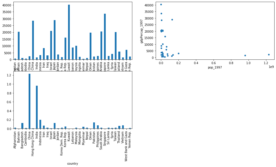
In the example above,
we also use x= and y= to plot two columns against each other.
Notice how the column names (“pop_1997” and “gdpPercap_1997”)
were referred to as strings -
it is assumed that string values like these will refer to columns inside the
DataFrame from which plot was called.
Other plotting methods
Much like in matplotlib, pandas can produce different
kinds of plots besides those via.plot()(the full list is:area,bar,barh,box,density/kde,hexbin,hist,pie, andscatter), there also exist separate.histand.boxplotmethods, which use a separate interface. When searching for help and reading examples online, you might see these methods being used instead of.plot(kind='box')or.plot(kind='hist').
Automate Away the Repetition
Whenever we see recurring patterns in our code, it’s a sign that something could be encapsulated into its own function. We can then call this function every time we want to perform the same operation.
Rearrange the lines of code below to define a function that returns a filtered subset of the given dataframe, containing only the data for the chosen year. (As well as re-ordering the lines, you will need to adjust the level of indentation of some lines.)
(To remind yourself of what some of these lines are doing, you may want to look back at the sections on Handling Exceptions and Working with Data).
return (df[f'gdpPercap_{year}'], df[f'lifeExp_{year}'], population)
except ZeroDivisionError:
def get_year_data(df, year, pop_scale_factor=1e6):
population = df[f'pop_{year}']/pop_scale_factor
raise ZeroDivisionError("Can't divide by zero. For unscaled population data, please specify pop_scale_factor=1")
try:
Solution
def get_year_data(df, year, pop_scale_factor=1e6):
    try:
        population = df[f'pop_{year}']/pop_scale_factor
    except ZeroDivisionError:
        raise ZeroDivisionError("Can't divide by zero. For unscaled population data, please specify pop_scale_factor=1")
    return (df[f'gdpPercap_{year}'], df[f'lifeExp_{year}'], population)
Formatting Data Points
- Fill in the blanks in the function definition below so that the colour of the circles represents the continent that country belongs to.
Note that the approach below uses a list comprehension to define a colour to represent each continent, and
*to unpack the tuple returned byget_year_data(the function we defined in the previous exercise). You may wish to check back to the earlier sections on comprehensions expanding arguments outside functions to remind yourself of what is happening here.from matplotlib import cm continents = list(gapminder['continent'].unique()) continent_colors = [cm.Set2.colors[continents.index(c)] for ___ in gapminder[___]] fig, ax = plt.subplots() ax.scatter(*get_year_data(gapminder, 2002), ____, alpha=0.75) ax.set_title('2002') ax.set_xscale('log') ax.set_xlabel('GDP per capita (USD)') ax.set_ylabel('Life expectancy (years)')
- What is the
alphaargument doing in theax.scattercall above? Try adjusting the value to see what effect this has.Solution
# 1
continents = list(gapminder['continent'].unique())
continent_colors = [cm.Set2.colors[continents.index(cont)] for cont in gapminder['continent']]

fig, ax = plt.subplots()
ax.scatter(*get_year_data(gapminder, 2002), c=continent_colors, alpha=0.75)
ax.set_title('2002')
ax.set_xscale('log')
ax.set_xlabel('GDP per capita (USD)')
ax.set_ylabel('Life expectancy (years)')
2:
alphacontrols the transparancy of the plotted data points. A value of 1 makes the points opaque, 0 makes them invisible (fully transparent). For a plot like this, with many overlapping points of varying size, some transparency is helpful to get a complete understanding of the distribution of points.
Where to go from here
The Matplotlib Gallery
The gallery of plots is one of the most useful resources in the
overwhelmingly large matplotlib documentation (the complete documentation PDF is a whooping 2767 pages long!!!).
The gallery provides an excellent reference for examples and code from where one can gather bits and pieces in order to assemble our dream plot. You may find that the code tends ot get rather verbose the more complex the plot gets. This is the price to pay for matplotlib’s flexibility.
Pandas documentation
We have only superficially explored the pandas plotting interface here
because we don’t want to create further confusion by dwelling on
yet another interface to Matplotlib.
If you’d like to learn more about this topic,
we recommend the following resources:
- pandas user guide
- links included in pandas “cookbook” section on plotting
- a blogpost about changing the plotting backend used by Pandas
Many of the plotting functions in pandas return matplotlib objects.
However, you may find that pandas implemented its own convenient functions,
better suited to the dataframe way of handling data.
Stack Overflow
When the official documentation is not enough, you may find communities such as stack overflow extremelly helpful. This website is also indexed by most modern search engines. Mastering the right keywords to describe the task at hand is key to finding the best answer.
Anecdotally, this website is so great that the authors of this lesson have found themselves searching for a solution to a problem for which the best and highest voted answer is a post of their own authorship.
Books and Other
Matplotlib’s documentation also includes a non-exhaustive book, video and other tutorials section in their documentation.
Other useful resources can be found in popular online learning platforms such as edX, Coursera and many others.
Plotting in 3D
Matplotlib ships with mplot3d, a 3D plotting interface.
This interface is still under development and is considered by the authors to be functional,
but not complete.
If you need advanced 3D capabilities, you might want to look into VTK, Blender3D or if visualizing 3D proteins, the well known pymol.
Widgets in jupyter
Previously we mentioned that Jupyter can assist with the try-and-see nature of plot generation. If you want to go beyond the edit code and re-run approach you should consider Jupyter widgets.
With little code, you can add sliders, drop-down boxes and other HTML elements to your
Jupyter output. The interact() function, leverages these widgets
to provide a convenient way to re-plot results triggered
by the simple action of moving a slider or ticking a checkbox.
These widgets really shine when you want to have a flexible and interactive way to experiment with different thresholds, perhaps while showing your latest results to your colleagues.
Additional challenges
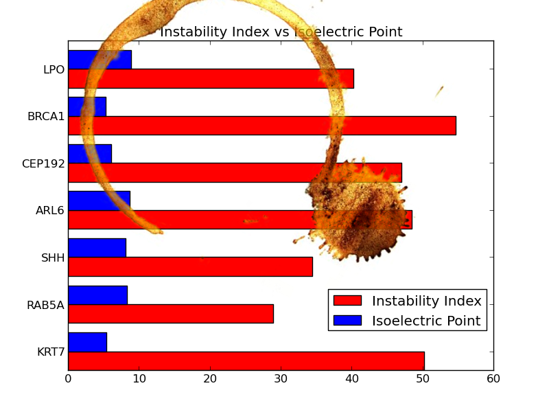
The coffee stain
Accidents happen and hard lessons often come in a spiky package!
You knew that the day your laptop got stolen, with the only copy of your code and analysis inside, was going to come back to to haunt you. You promised yourself that you wouldn’t make the same mistake twice, that you’d learn how to use git and have a backup. You were considerate enough to print your plot and add it to your lab book but today, this happened:
As your group works on different aspects of the same proteins, you managed to get the protein sequences from your colleague. With this information, you must now recreate the plot to look as close as possible to the original. You will have to calculate the isoelectric point and instability index of the proteins.
Hint
The
Biomodule is part of the biopython package. The following function can help you calculate both measures.from Bio.SeqUtils import ProtParam def calculate_isoelectric_and_instability(sequence): """ Calculates isoelectric point and instability index on a protein sequence """ params = ProtParam.ProteinAnalysis(sequence) instability = params.instability_index() iso_elect = params.isoelectric_point() return (instability, iso_elect)You can also use
Bio.SeqIOto read the protein sequences in fasta format.Solution
A possible solution to this challenge is:
import matplotlib
matplotlib.use("Agg")
import matplotlib.pyplot as plt

from Bio import SeqIO
from Bio.SeqUtils import ProtParam

def calculate_isoelectric_and_instability(sequence):
    """
    Calculates isoelectric point and instability index on
    a protein sequence
    """
    params = ProtParam.ProteinAnalysis(sequence)
    instability = params.instability_index()
    iso_elect = params.isoelectric_point()
    return (instability, iso_elect)


def compute_measures(inputfile):
    """
    A generator that reads one sequence at a time from the provided fasta file
    and calculates isoelectric and instability indices
    """
    for seq_record in SeqIO.parse("data/proteins.fasta", "fasta"):
        prot_sequence = str(seq_record.seq)
        instability, iso_elect = calculate_isoelectric_and_instability(prot_sequence)
        yield seq_record, instability, iso_elect


def make_plot(data):
    width = 0.4
    ylabels = []
    ylocation = []

    for i, results in enumerate(data):
        sequence_record, insta, iso_elect = results

        ylocation.append(i + width)
        label = sequence_record.name

        ylabels.append(label)

        p1 = plt.barh(i, insta, width, color="red")
        p2 = plt.barh(i + width, iso_elect, width, color="blue")

    plt.yticks(ylocation, ylabels)
    plt.title("Instability Index vs Isoelectric Point")

    # How to position the legend can be found on:
    # http://matplotlib.org/users/legend_guide.html
    plt.legend((p1, p2), ("Instability Index", "Isoelectric Point"),
               bbox_to_anchor=(0, 0.1, 1, 1),
               loc=4)

    plt.savefig("isoelectric_instability.png")


if __name__ == "__main__":
    sequence_file = "data/proteins.fasta"
    results = compute_measures(sequence_file)
    make_plot(results)
Key Points
Matplotlib is a powerful plotting library for Python.
It can also be annoyingly fiddly. Jupyter can help with this.